Working with Charts
The main 5 types of graphs are Comparison, Contribution, Trend, Correlation and Slab or Value slabs.
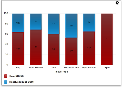
In Comparison, the Horizontal, Vertical Bar Charts and Area Chart are present.
Comparison View:
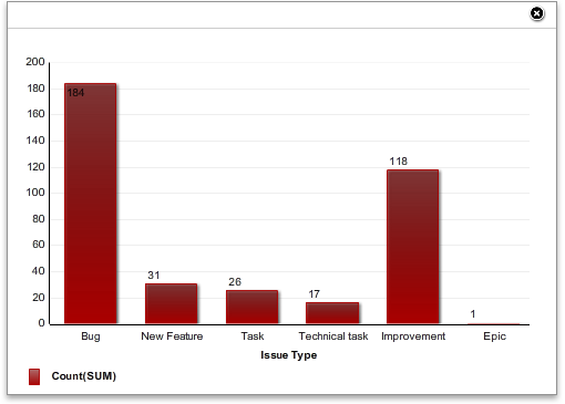
Here, the fact values are displayed in vertical axis while the dimensions are displayed in horizontal axis.
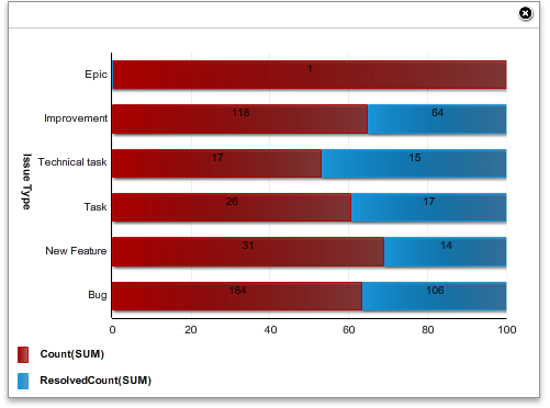
b. Bar Chart:
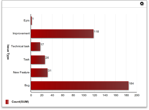
In this graph, the axes are just the opposite of Column Chart.
c. Area Chart:
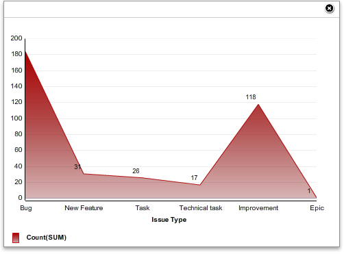
This is a continuous graph. The sharp points of this graph are the values coming from the data-set. Those are just joined to draw it.
Contribution:
a. Pie Charts:
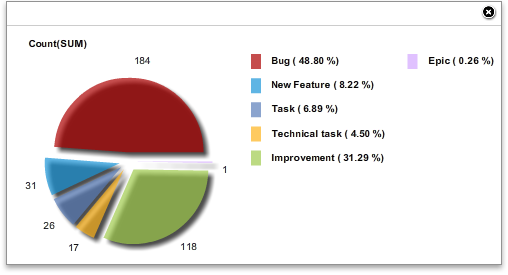
This is the example of a pie chart available from this application. The chart area is divided according to various dimensions after calculating fact values.
b. Bar Contribution Chart:
In this chart, the data values are calculated horizontally. Each bar displayed for a dimension. The facts are calculated on that dimension and takes part in its contribution with a particular color. So, for each fact, this chart defines a new color. The color codes are also defined with the graph.
c. Column Contribution Chart:
This is just the vice versa of the previous one i.e. Bar Contribution Chart.
d. Trend Chart (Line Chart):
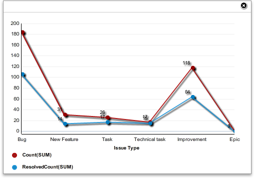
This is line chart drawn from the dimensions in horizontal axis. Each line indicates a fact. Graphs are displayed with their color code information.
e. Correlation Chart :
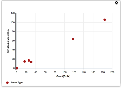
The above one is an example of Correlation Chart. This chart can only be created with 2 or 3 facts associated with single dimension.
In the correlation charts produced by two facts, the positions are calculated according to both axes where each axis defines a fact. The points are located colorfully in the graph. And in the correlation of three facts, position calculation is same but here the third fact defines the radius of the selected points’ oriented circles. The above one shows correlation for 3 fact values.
Slab:
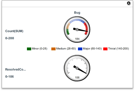
This is the example of a Slab chart. Here, each fact associated with each dimension displays a separate slab. Inside a slab, user can define his/her custom ‘Value Slab’s i.e. the fact values displayed in the Speedo can be divided into based on defining multiple value slabs. Each value slab carries different color. At an instance of time, a Slab defines a particular fact value.
Created with the Personal Edition of HelpNDoc: Easily create HTML Help documents